How do technological advancements correlate with economic prosperity?
About my Question Choice
For this assignment, I really wanted to take a deeper look into the Human Development Indicators between 1960-2020. My mother is an academician in human development and economics, and ever since I recognize my existence, this topic has been close to my attention.
I chose to investigate the correlation between technological advancements and economic prosperity. Specifically, my analysis focused on the relationship between high-technology exports (as a percentage of manufactured exports) and GDP per capita (constant 2010 US$). This topic intrigued me due to its relevance in understanding how different nations leverage technology for economic growth.
I have used the already cleared version of the data, and did more cleaning-grouping later in Tableau Desktop.
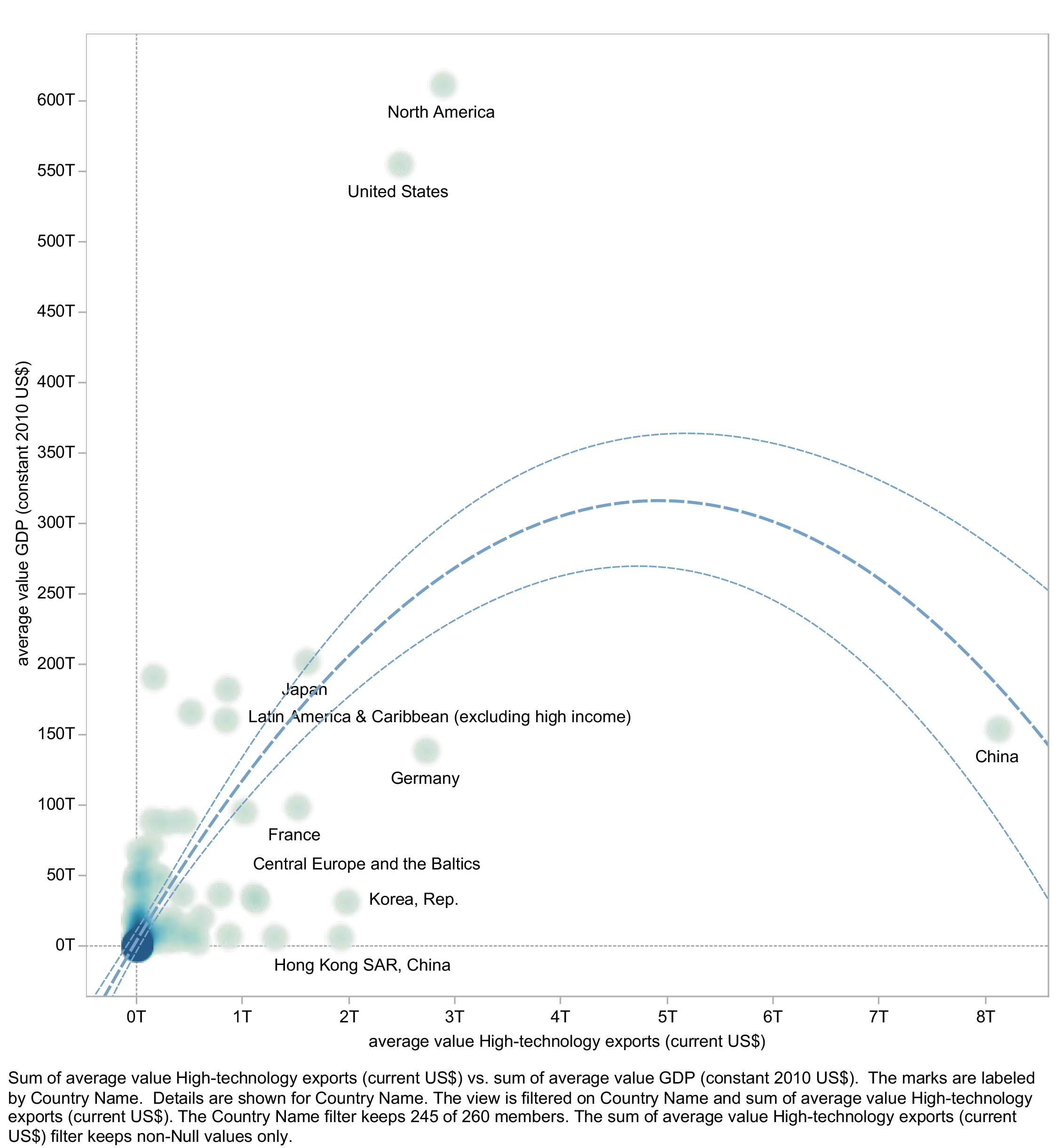
For the persuasive visualization, my goal was to convincingly demonstrate a positive correlation between high-technology exports and GDP per capita. In Tableau Desktop, I created a scatter plot that clearly shows each country's position regarding these two variables. By adding a trend line, I aimed to reinforce the perception of a strong positive relationship. My design choices were intended to highlight the data points that align well with this narrative through using a straightforward linear scale and ensuring that the trend line accurately reflects the data's overall direction.
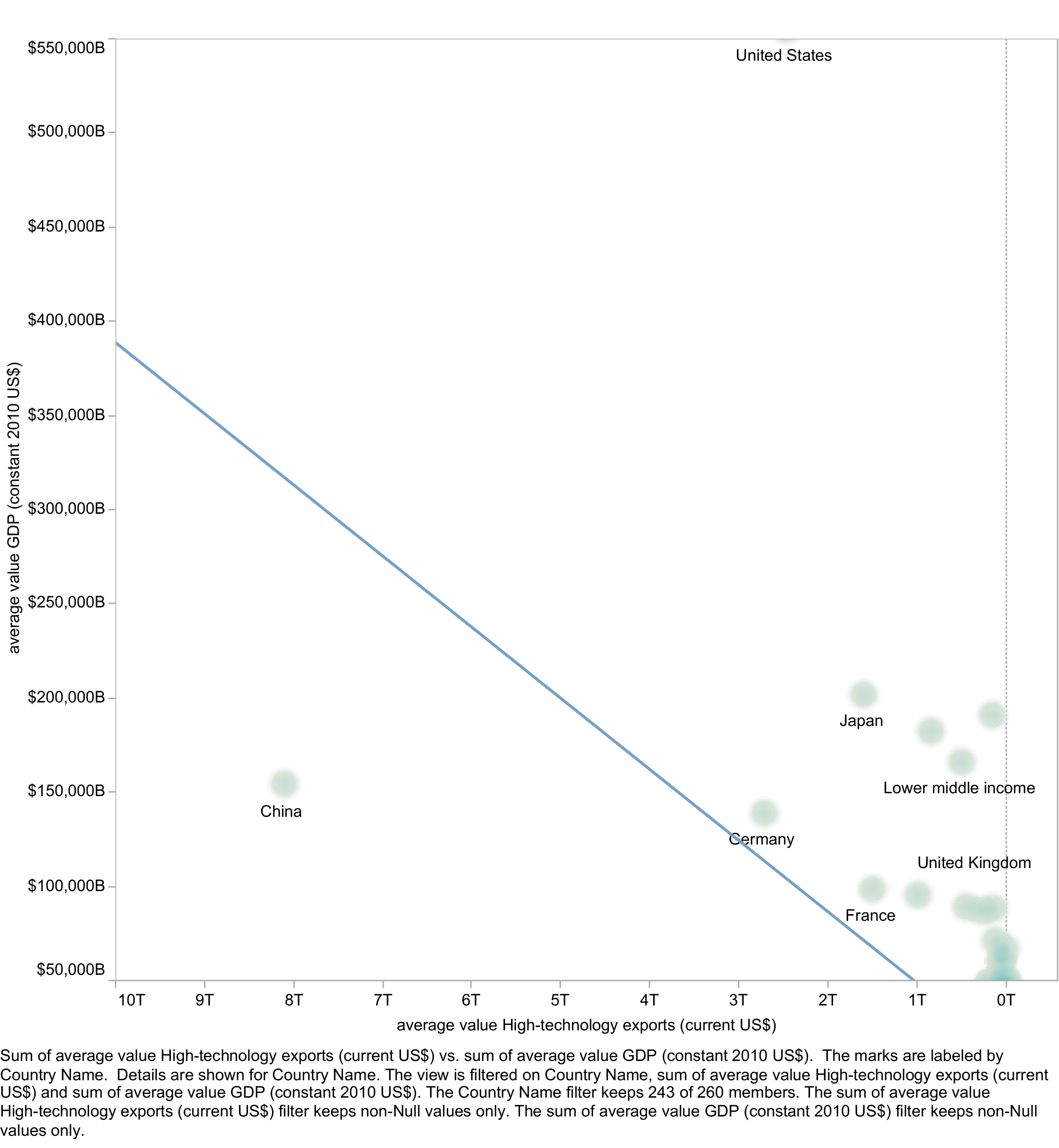
Conversely, the deceptive visualization was crafted to challenge the viewer's perception and suggest a less clear or even non-existent relationship between the variables. To achieve this, I manipulated the axes by truncating them and altering the scales, which distorted the data spread. Additionally, I added a descending trend line, misleadingly suggesting no correlation. These manipulations were deliberate to showcase how data could be misrepresented to support a particular narrative or mislead the audience.
In completing my data visualization assignment, I aimed to craft a visualization that would serve as an exemplar of how data could be depicted in a misleading way. This was done not to deceive for any malicious intent but to underline the ethical boundaries within which data representation must operate.
For the deceptive visualization, I chose to implement several techniques that would skew the viewer's perception of the data:
Selective Presentation: I intentionally displayed a limited set of data points, omitting a significant portion of the dataset that would have illustrated the true nature of the correlation.
Trend Line Manipulation: I inserted a descending trend line, suggesting a negative correlation where none might exist or the actual relationship might be positive. This was a calculated move to demonstrate how a trend line could suggest a trend opposite to what the full scope of data might reveal.
Axis Truncation: Though not evident at first glance, I manipulated the axes to create a truncated view, potentially leaving out data points that did not fit the narrative I was artificially constructing.
Scale Distortion: I carefully chose the scales to accentuate the deceptive quality of the visualization. While the axes appear linear, their manipulation amplifies the disingenuous narrative.
This visualization does not reflect my personal values or how I approach data in practice. Rather, it exemplifies a contrived scenario to fulfill the academic exercise of highlighting the importance of ethical data representation. I understand that in the real world, such practices can lead to misinformed decisions with significant consequences.
Motivations and Reflection:
My primary motivation for these visualizations was to delve into the ethical considerations of data visualization. By constructing one visualization that earnestly represents the data and another that intentionally distorts it, I aimed to underscore the critical role of a data scientist's integrity. This exercise reinforced my understanding that how we present data can dramatically shape perceptions and decisions; as it highlights the importance of ethical standards in data visualization.
Conclusion:
Through this assignment, I gained valuable insights into the power of data visualization as a tool for storytelling. It became evident that while data can inform and enlighten, it can also mislead and misinform, depending on how it's presented. This lesson will profoundly influence my approach to data visualization, ensuring that I prioritize accuracy, clarity, and ethical considerations in my future work.
In my reflection on the process, I believe that responsibility lies heavily on the shoulders of data scientists and analysts to present data with integrity.

 Back to Projects